CSS flex-box sounds like a lot to learn, but we need to start using it right now
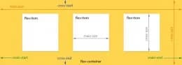
The Flexbox Layout officially called CSS Flexible Box Layout Module is new layout module in CSS3 made to improve the items align, directions and order in the container even when they are with dynamic or even unknown size. The prime characteristic of the flex container is the ability to modify the width or height of its children to fill the available space in the best possible way on different screen sizes.
Many designers and developers find this flexbox layout easier to use, as positioning of the elements is simpler thus more complex layouts can be achieved with less code, leading to simpler development process. Flexbox layout algorithm is direction based unlike the block or inline layout which are vertically and horizontally based. This flexbox layout should be used for small application components, while new CSS Grid Layout Module is emerging to handle the large scale layouts.
Read more from the source: Scotch